Skip to content

Cross Energy

Client
Cross Energy
Discipline
Branding, brand strategy and art direction
Year
2026

A branding project developed for Cross Energy, an energy technology startup focused on improving the efficiency of existing infrastructure. The identity positions the brand not as an energy generator, but as an engineering company that transforms how available energy is controlled, optimized and used.

The challenge

Cross Energy needed to present an advanced and technically complex solution to investors, industrial partners and potential customers. Its technology works with existing energy systems, integrating with solar, hybrid and broader generation infrastructures to increase usable output without requiring the replacement of core equipment. Its first commercial product, the CE-100, combines photovoltaic generation, storage, an inverter and a proprietary control layer. The challenge was to transform this technical complexity into a clear, robust and credible brand capable of communicating engineering, efficiency and real-world application without relying on the generic visual codes of the renewable energy market.

My role

I worked as Lead Designer, responsible for the brand strategy, visual concept and art direction. I led the development of the positioning, identity and visual system across the company's main touchpoints, including commercial presentations, institutional communication, product applications, digital interfaces and materials created for an international audience.

Decisions

Energy, engineered for efficiency

The positioning begins with an important shift in perception: Cross Energy does not generate more energy, it enables available energy to perform more efficiently. The statement presents the company as an engineering business focused on efficiency, control and intelligence applied to energy systems.

A brand built from the product

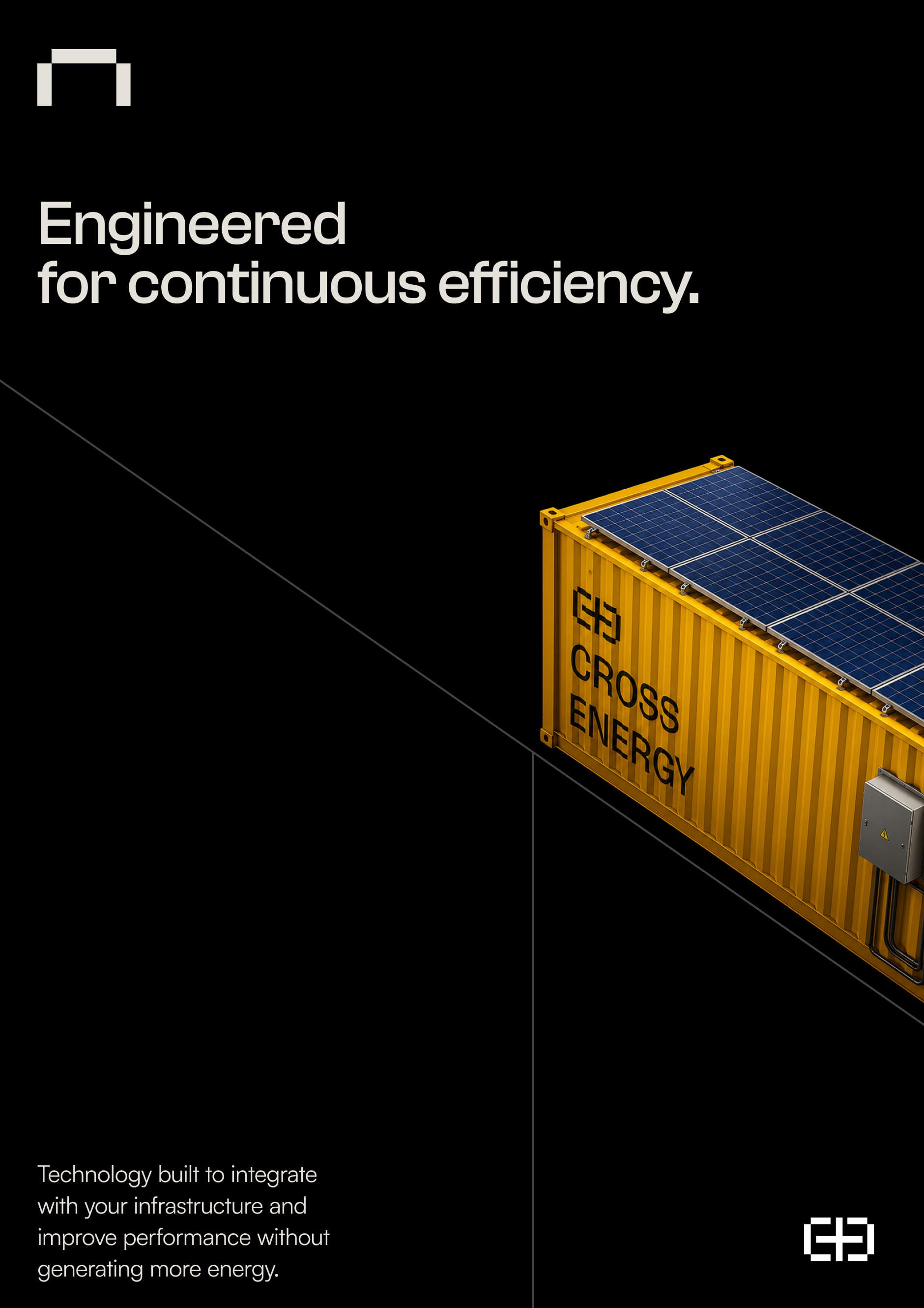
The symbol originated from the physical structure of the container that houses the Cross Energy solution. This form was simplified into a technical and proprietary icon. Its lateral cuts represent points of connection and intervention, reflecting how the technology integrates with existing infrastructure.

Energy, connection and identity

The symbol's geometry also evokes the immediate shape of a battery, connecting the brand to the energy sector without relying on literal elements such as lightning bolts, leaves or solar panels. At the same time, the structure subtly incorporates the letter “C”, bringing function and identity together in a single element.

Engineering with presence

The art direction combines black, white and yellow to create a high-contrast, robust and recognizable identity. Black communicates structure and precision. Yellow brings energy, visibility and a direct connection to the physical product. Photography and large-scale compositions reinforce that Cross Energy operates within real infrastructure, not only through a conceptual promise.

Turning complexity into clarity

The visual system was designed to organize technical content, commercial arguments and performance comparisons in an accessible way. Typography, grid, data and product imagery work together to connect innovation, engineering and economic value, allowing the brand to communicate with specialists, investors and business decision-makers.

Pieces

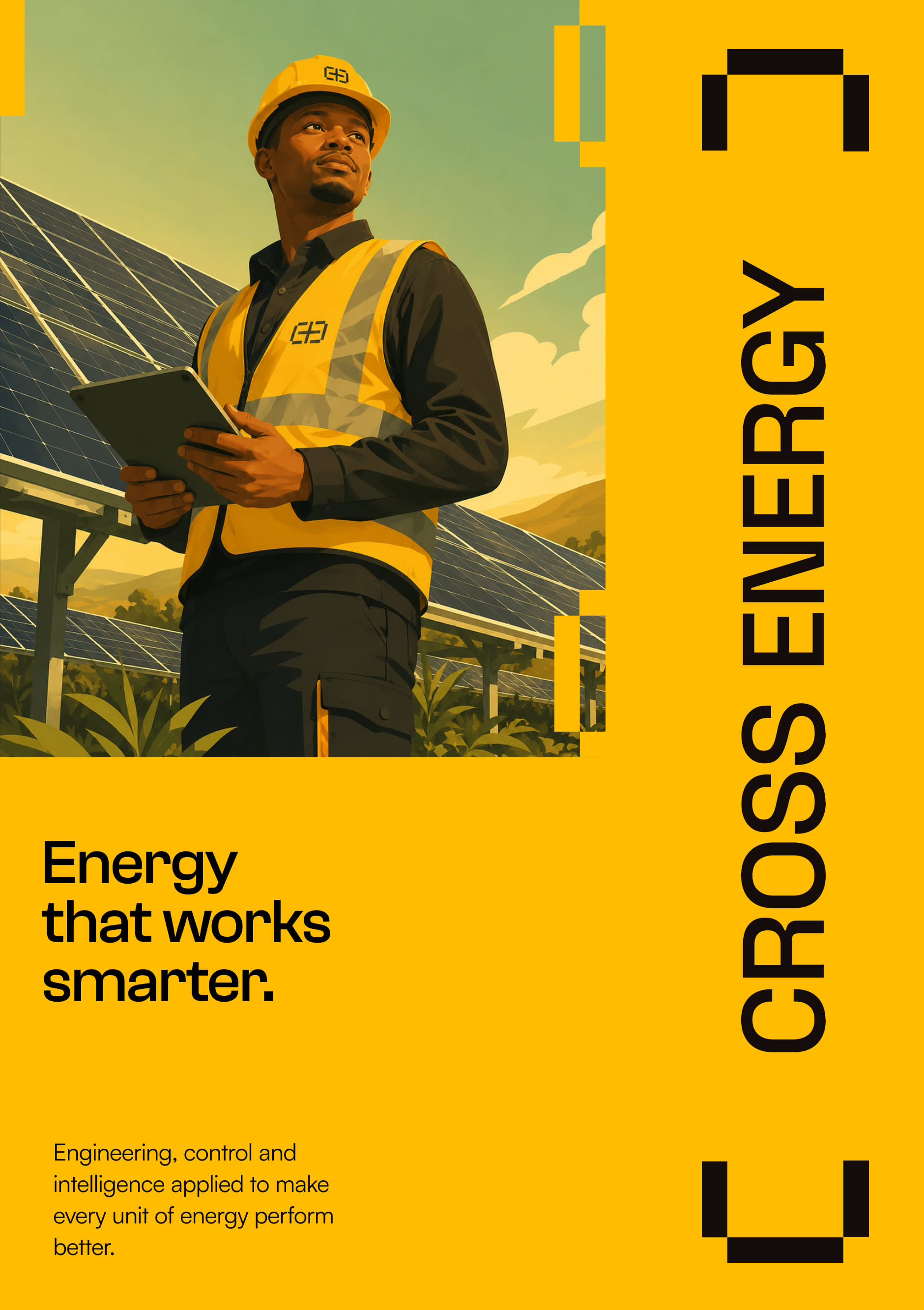
Yellow poster “Energy that works smarter”, with a technician in front of solar panels
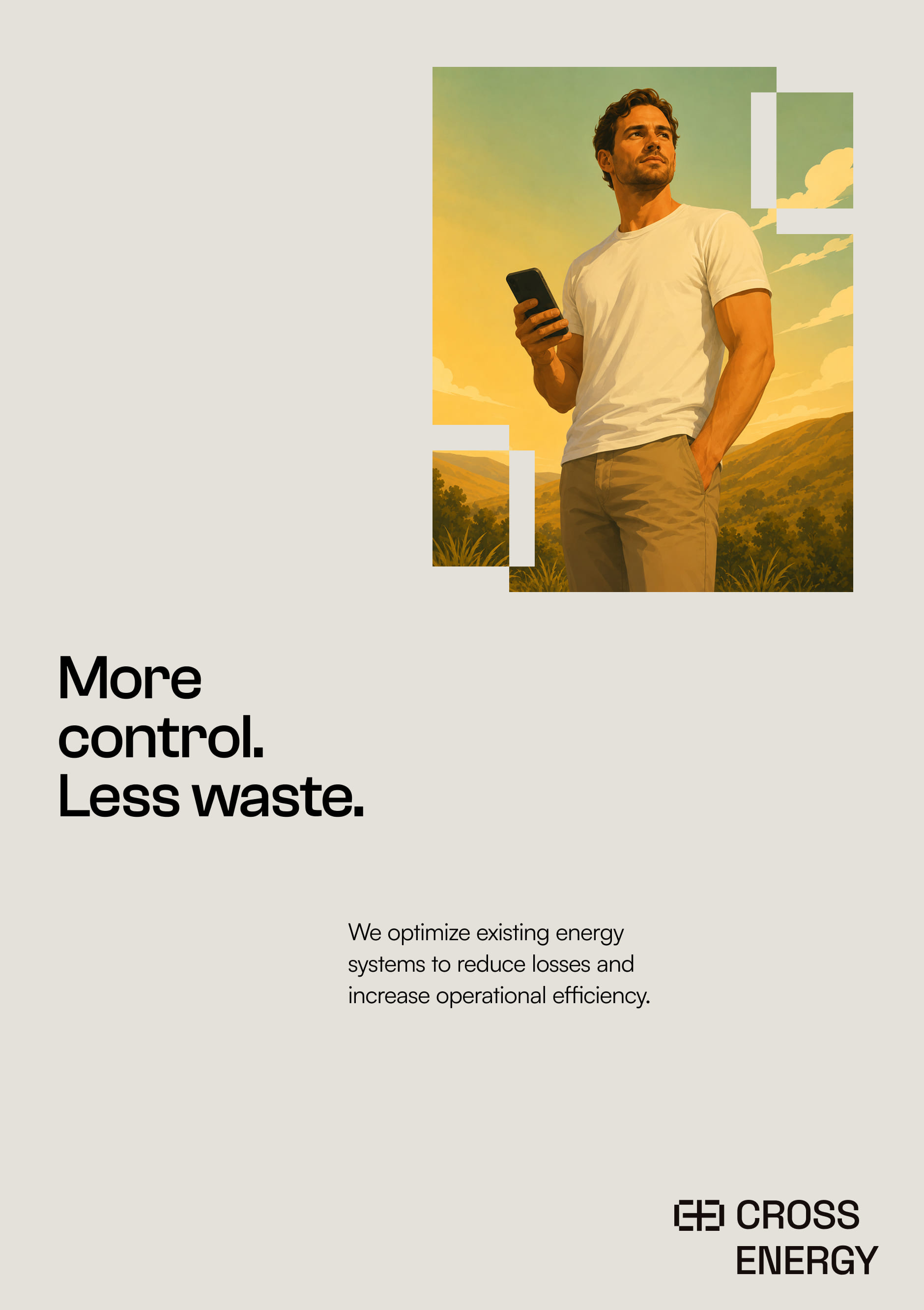
Light poster “More control. Less waste.”
Black poster “Engineered for continuous efficiency”, showing the CE-100 container
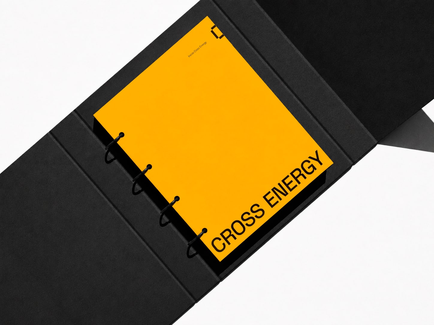
Open black binder with yellow insert and the Cross Energy brand on the inner cover
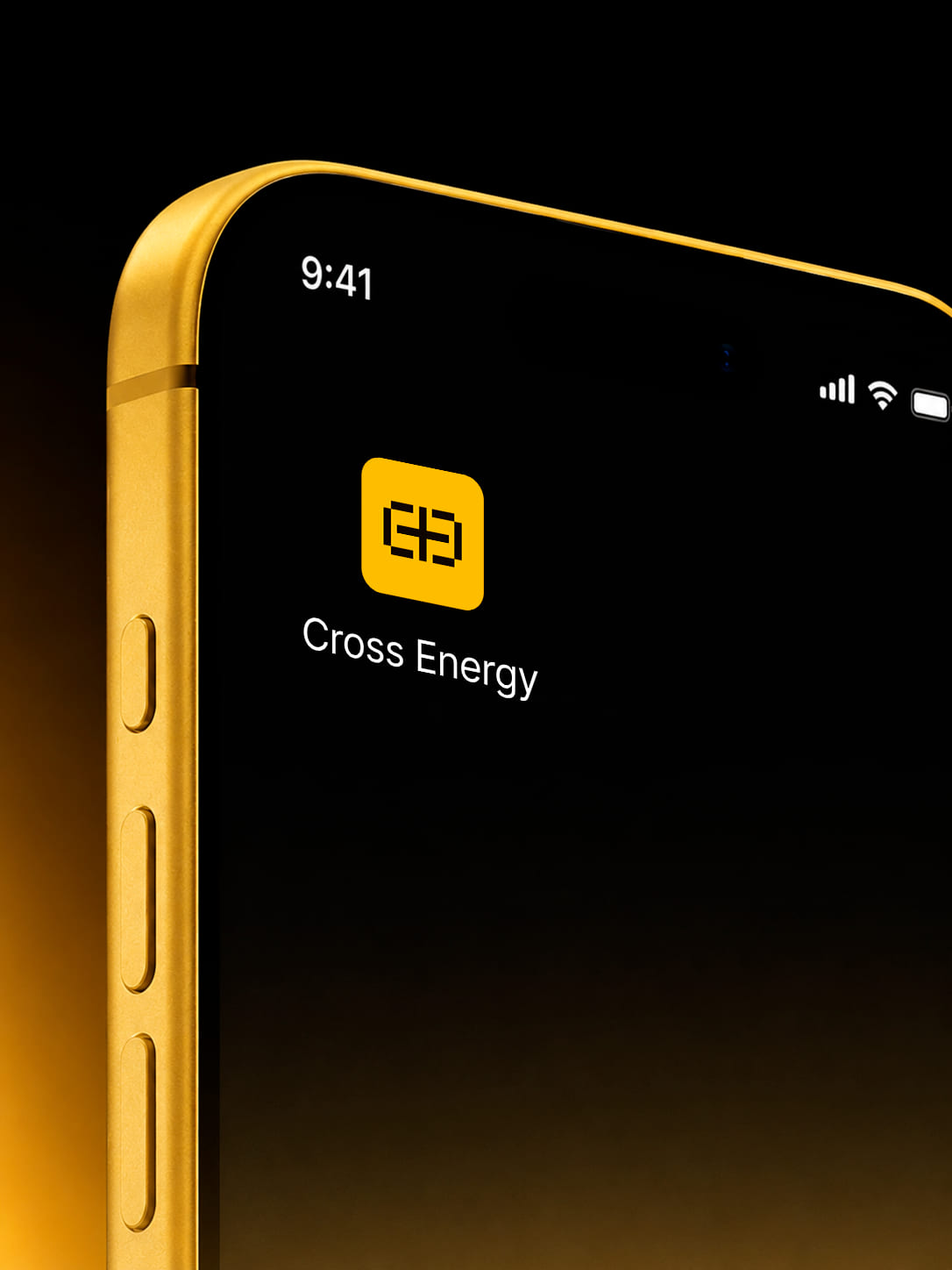
Cross Energy app on the phone screen
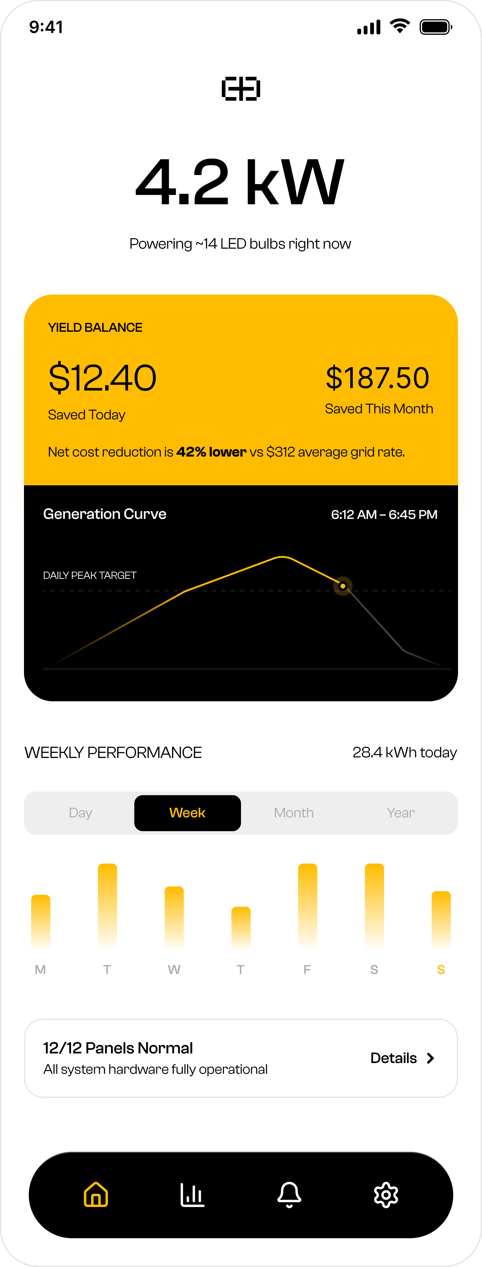
App dashboard showing output in kW and the consumption chart
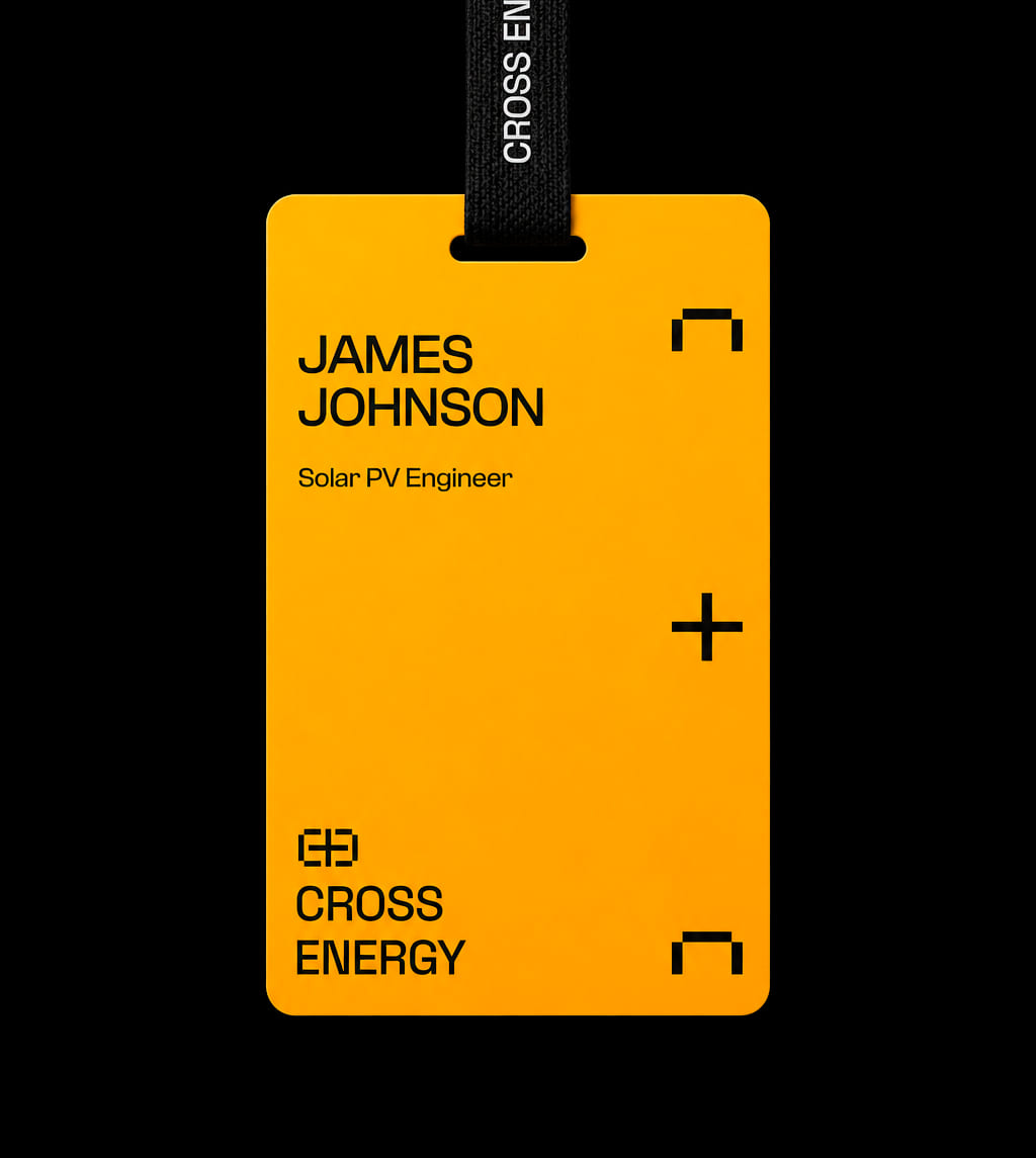
Black and yellow ID badge with the brand symbol
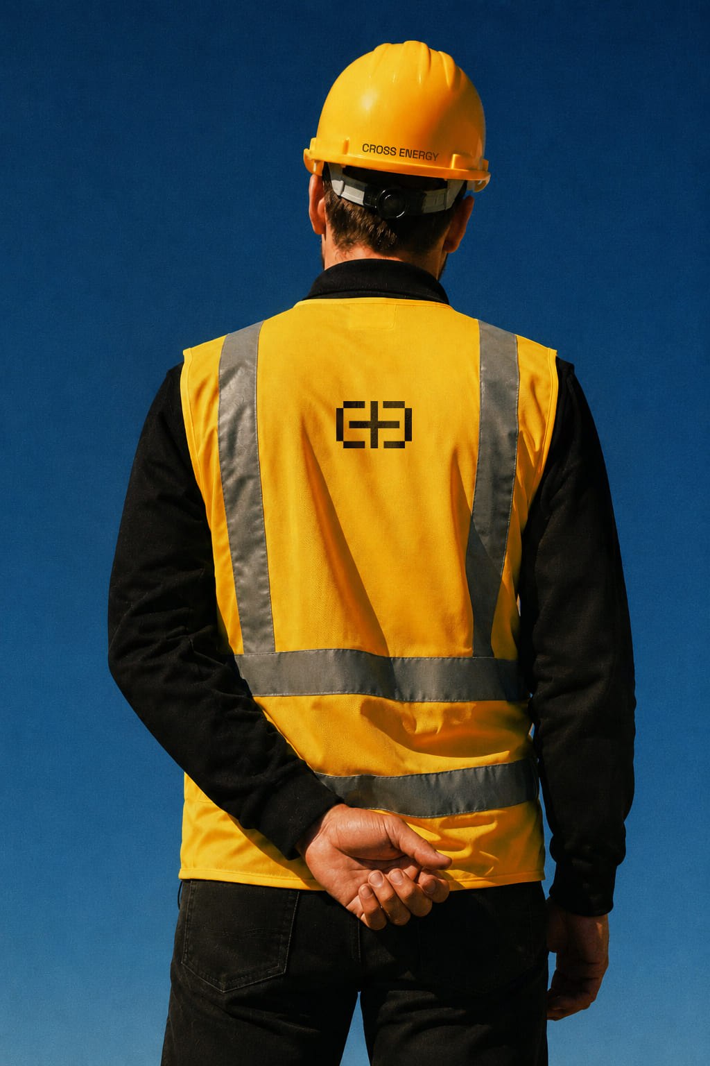
Field uniform: hard hat and reflective vest with the brand on the back
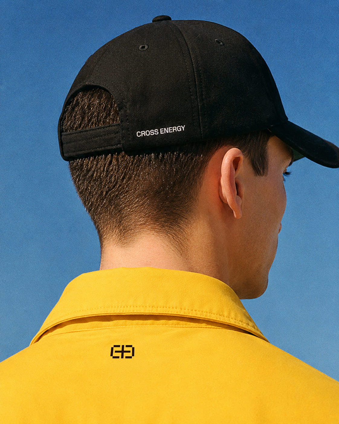
Black cap and yellow polo shirt with the embroidered brand
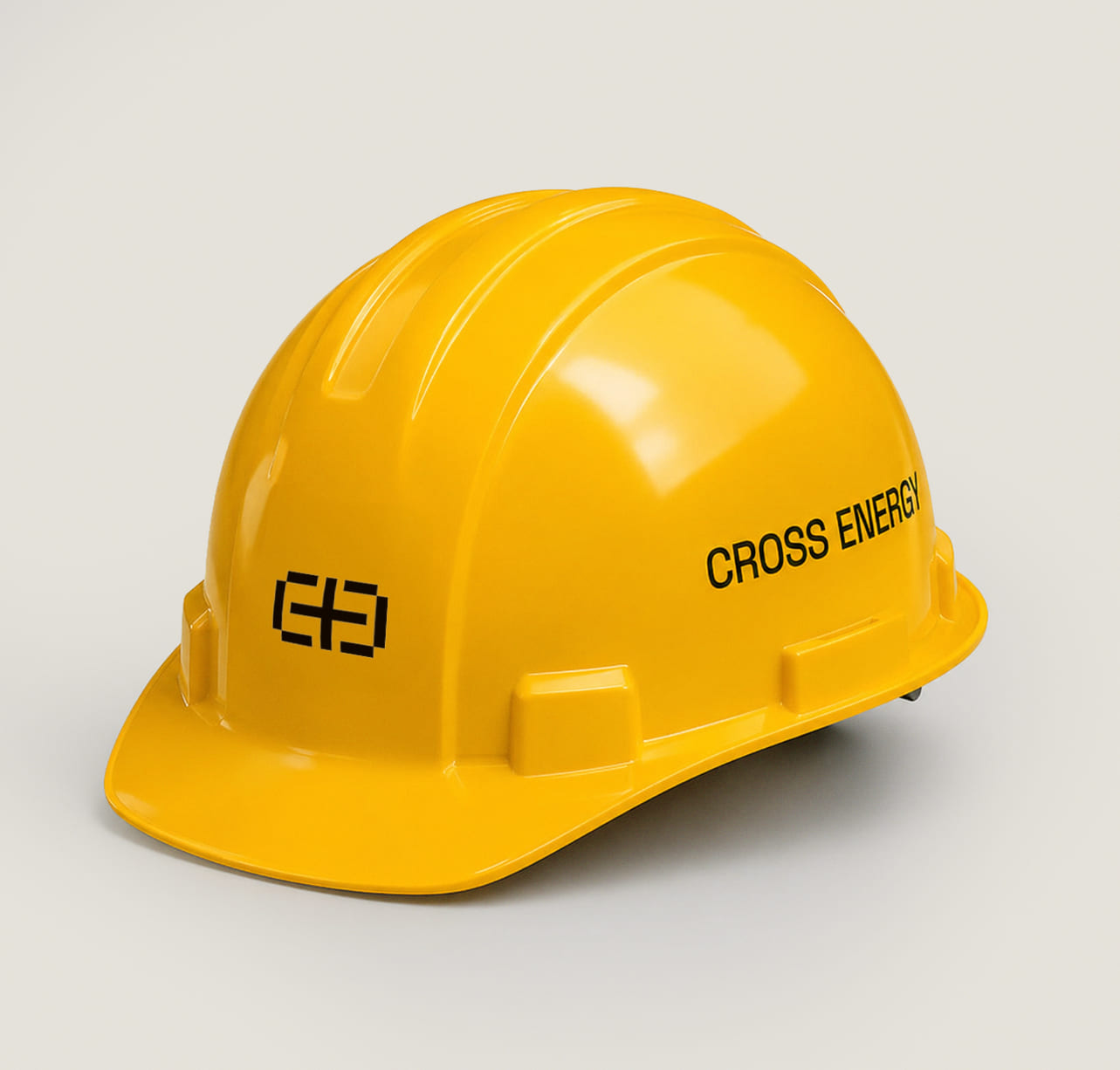
Yellow hard hat with the Cross Energy brand
Next projectTela