Skip to content

Vaz

Client
VAZ
Discipline
Branding, positioning and art direction
Year
2023

A branding project created to organize and reposition Renato Vaz’s work in the events and brand activation market. The new identity separates his personal presence from his professional operation and turns his experience into a clearer, more sophisticated brand prepared for corporate projects.

The challenge

Renato Vaz had already built strong recognition in Natal’s social and corporate events market, working across major celebrations, weddings, ceremonies and high-end experiences. However, his communication lacked a clear positioning. Personal content, social events, ceremonial work and brand projects shared the same channels, making it difficult to understand his professional scope and the specific value of his work in brand activations. The challenge was to organize this presence, separate the different areas of activity and build a brand dedicated exclusively to corporate projects, experiences and activations.

My role

I led the positioning strategy, creative concept and art direction of the project. I was responsible for defining the brand’s new territory, shaping its value proposition and developing a visual identity capable of expressing sophistication, cultural awareness, presence and excellence in execution.

Decisions

A brand for a new territory

Creating VAZ made it possible to separate Renato Vaz’s personal image from his professional work in brand projects. The new brand became a dedicated platform for activations, experiences and corporate events, making the communication clearer and strengthening its commercial positioning.

Experience as the product

The positioning was built around Renato’s greatest strength: transforming events into memorable experiences. Rather than simply producing occasions, VAZ began to communicate curation, concept, narrative and execution, increasing the perceived value of the service.

Sophistication without excess

The visual identity was designed to communicate exclusivity and presence without relying on obvious decorative codes. Typography, composition, rhythm and image direction create an elegant and contemporary language suitable for both premium environments and the needs of companies and brands.

Personal recognition, brand structure

The new identity preserves the recognition associated with the Vaz name while organizing that reputation within a more professional and scalable structure. Renato’s personal influence remains present, now supported by a brand capable of sustaining new formats, partnerships and commercial opportunities.

Pieces

vaz wordmark animation
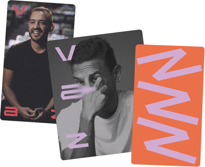
Three overlapping vaz cards — portraits and the wordmark in orange
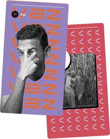
Two overlapping vaz cards — lilac portrait and red photo
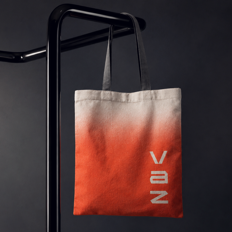
Orange gradient tote bag with the vaz wordmark
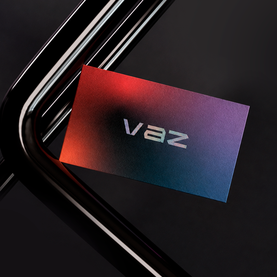
vaz holographic business card
Next projectDamassa