Santo
- Client
- Santo Comunicação
- Discipline
- Rebranding, visual identity and art direction
- Year
- 2025
- Art direction and design
- Alexandre Wake
- Brand strategy
- Thiago Garcia
A rebranding project for an agency specialized in internal communication and employee engagement.
The challenge
The previous identity did not clearly communicate the strategic value of Santo’s work. The brand needed to become more distinctive and recognizable while communicating intelligence and method without losing relevance within corporate environments.
My role
I led the visual strategy, creative concept and art direction. I developed the new brand language, including the symbol, identity and main applications.
Decisions
The idea
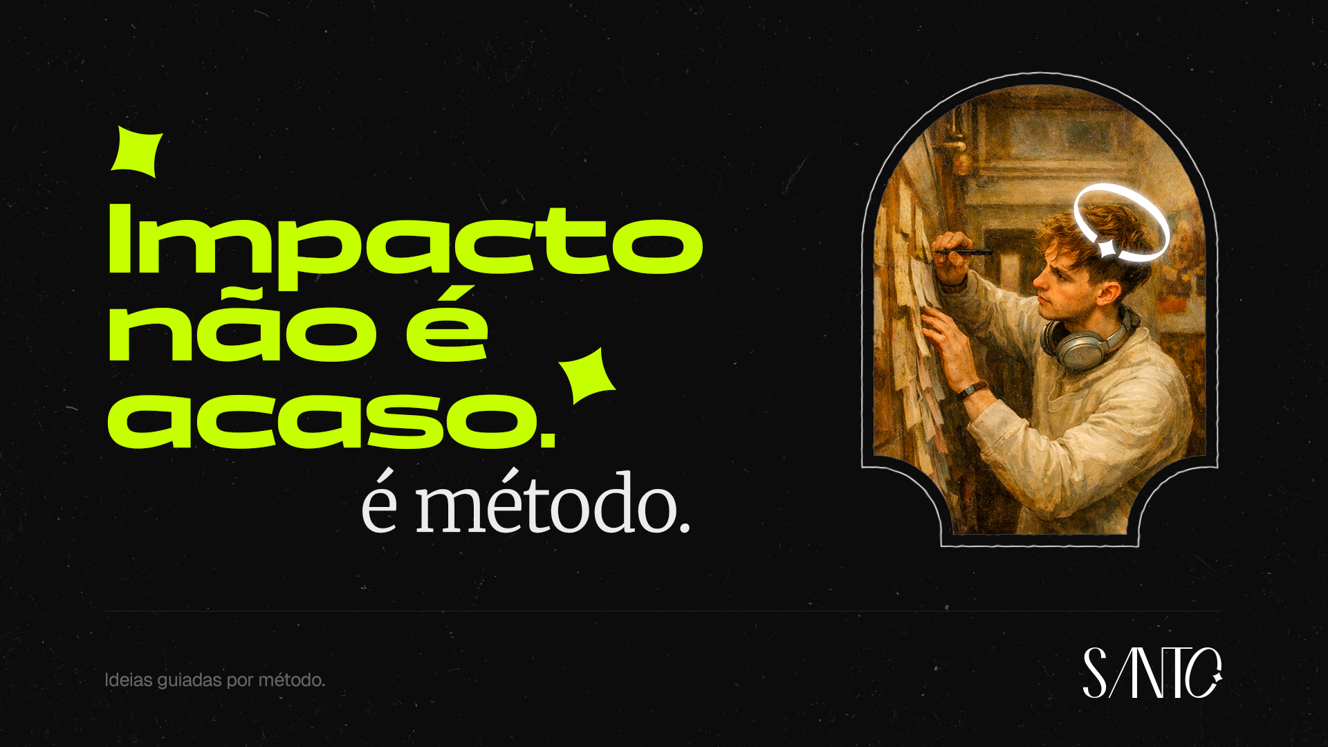
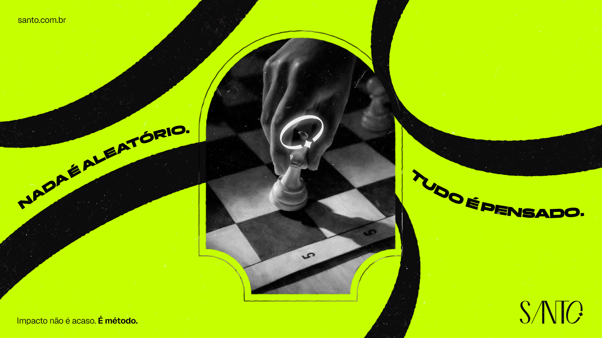

Impact is not accidental. It is method. The concept starts from the idea that meaningful internal communication requires strategy, intention and consistency.
The concept guides both the verbal positioning and the visual construction of the brand.
The system
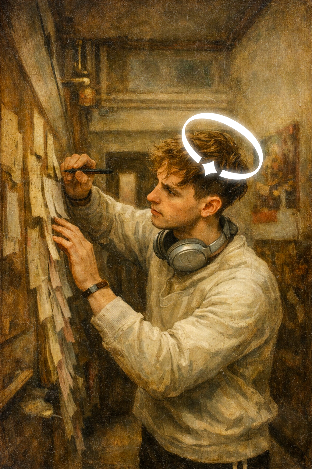
Renaissance references represent knowledge, intellectual construction and symbolic value. These codes were reinterpreted through contemporary typography and composition.
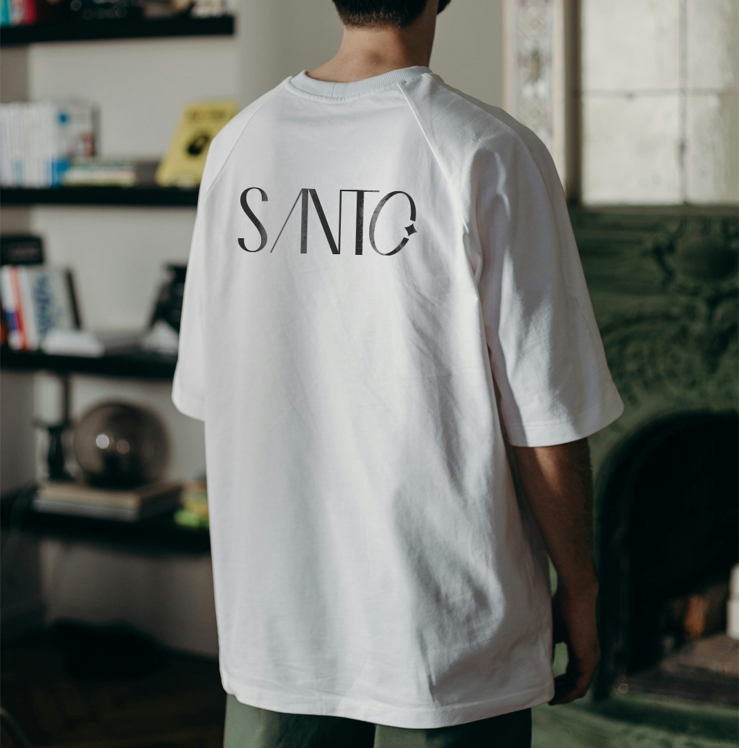
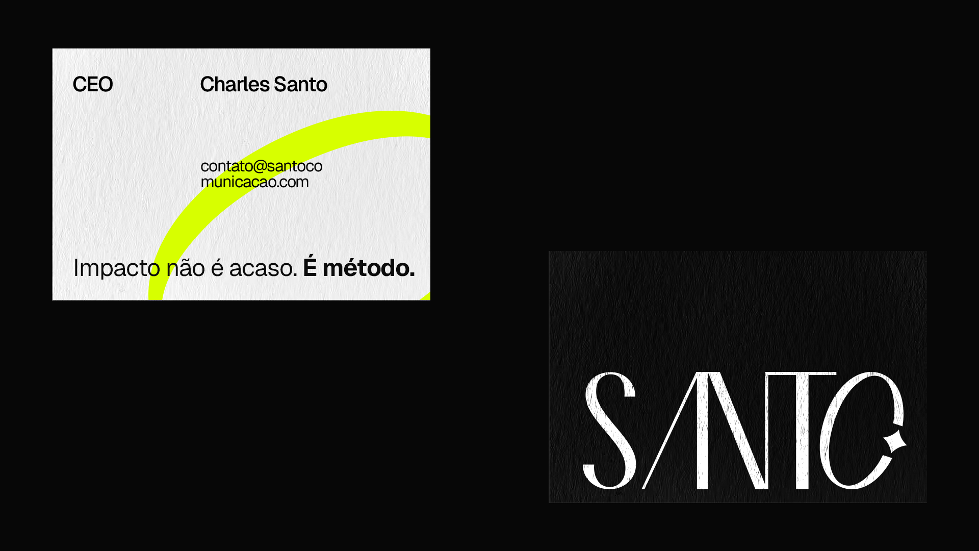
The “O” in Santo becomes a halo, creating an element directly connected to the name and capable of working as a visual signature.
The combination of classical references and a contemporary structure creates a distinctive identity without compromising clarity or versatility.
Pieces